 R for Spatial Statistics
 2D Plots
Simple Plots
You can plot just about any vector data in R by simply passing the data as parameters to the "plot()" function. Try some of the following and then your own plots.
x=1:20 # create a simple sequence
plot(x) # plot it
You can also create a scatter gram between two vectors. You only need to make sure the vectors have excatly the same number of entries.
x=1:20
y=x*x # creates a vector with x^2 exponential values
plot(x,y) # plots the x agianst y values
If you pass a function and then start and end values, plot() will show you that function executed for the range of values.
plot(qnorm) # quantiles of the normal distribution
plot(sin, -pi, 2*pi) # see ?plot.function
Adding Labels
Graphs really need to have at least a title and labels on the axis. You can add the parameters below to the plot() function to change the default labels.
main="Main Title"
xlab="X Axis Label"
ylab="Y Axis Label"
You can change the type of graph with the "type" parameter:
| Type | Description |
| p | Points |
| l (an "el") | Lines |
| b | Points and lines |
Stylizing the Data
You can also specify the color of the data with "col". Examples includes:
col="red"
col="blue"
You can use the same hexadecimal format as used with HTML. The format is "#RRGGBB" where RR, GG, and BB are hexadecimal values between 00 and FF.
plot(sin, 0, 2*pi,col="red",xlab="Independent Variable",ylab="Sine Values",main="Sine Function")
You can change the shapes that are used to plot data with:
- pch = 19: solid circle,
- pch = 20: bullet (smaller solid circle, 2/3 the size of 19),
- pch = 21: filled circle,
- pch = 22: filled square,
- pch = 23: filled diamond,
- pch = 24: filled triangle point-up,
- pch = 25: filled triangle point down.
Contributed by: Danielle Jones
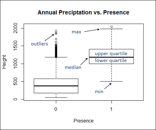
Box Plots
Box plots show information about the distribtuion of values between categories of data. The code below produced the box plot just below it. R will automatically find categories within the predictor variable. The box plot will then show the:
- Min: the minimum value of all the values for that category
- Max: the maximum value of all the values for that category
- Median: the middle of the range of values (i.e. half the values will be above and half below)
- Upper quartile: This box contains the first 1/4 of the data that is above the median
- Upper quartile: This box contains the first 1/4 of the data that is below the median
- Outliers: Values that are statistically outside the dominant distrubtion of the data.
boxplot(TheData$AnnualPrecip~TheData$Present,
 main="Annual Preciptation vs. Presence",
 xlab="Presence", ylab="Height")
Below is a box plot from the "boxplot()" function in R with annotations for the plot elements.
The figure below shows how quartiles are related to standard deviation in a normal curve.
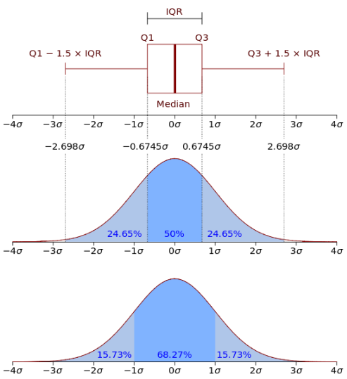
Wikipedia, 2014
Plotting Sorted Data to Check the Overall Distribution
You can sort a vector and then plot it's values. Then, you can overlay a straight line to see how much the data deviates from a straight line.
plot(sort(elev)) # to see elevation distribution
lines(c(1,160),range(elev),col=2)    # to overlay a straight line of perfect
Other Resources
Simple Plot from College of the Redwoods